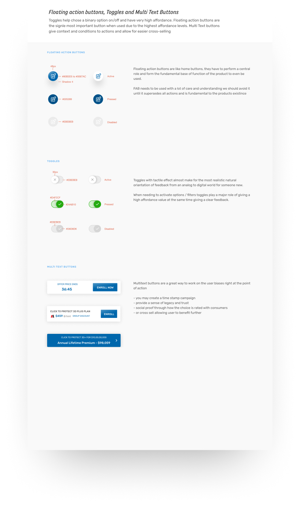
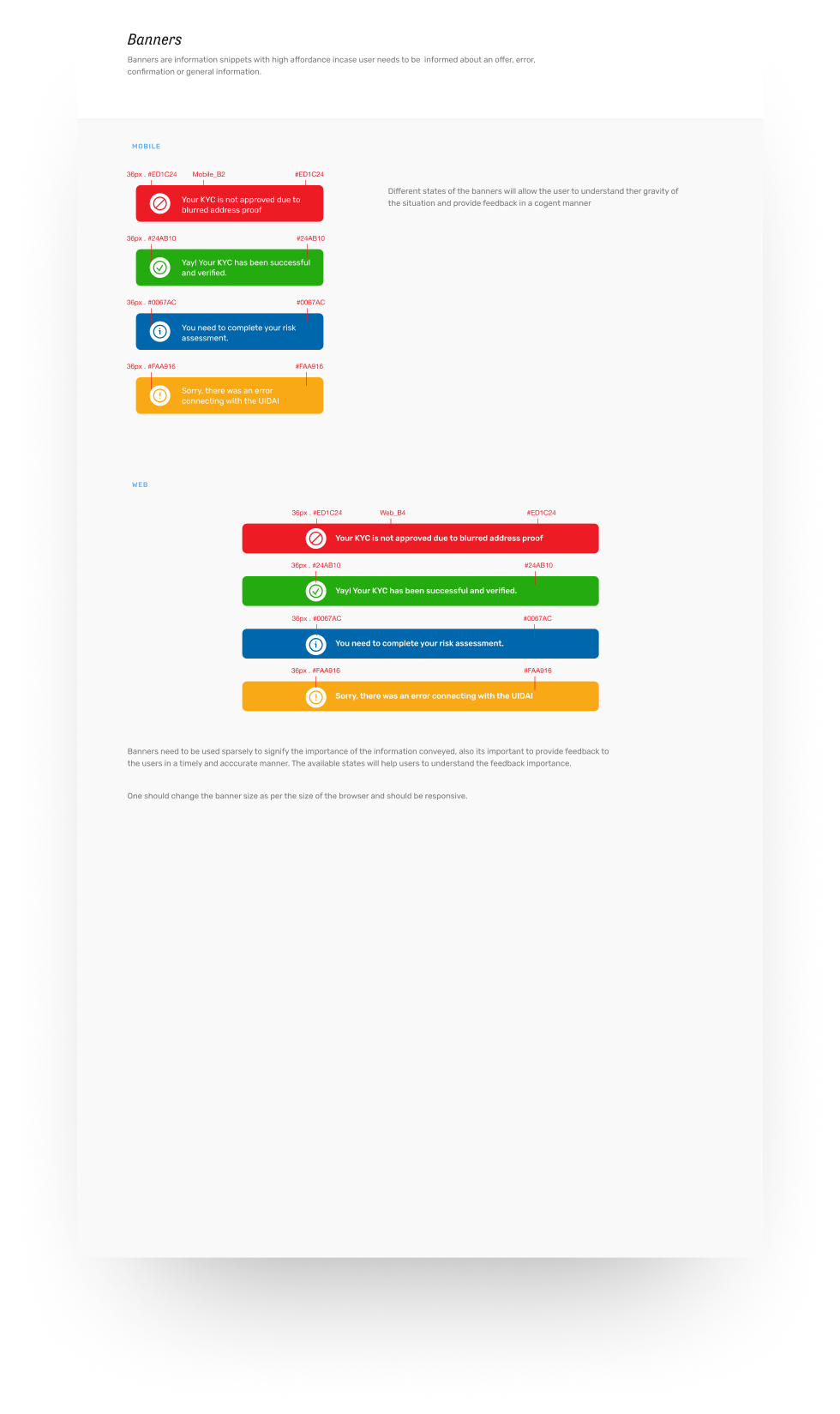
We knew that our atoms allowed us to emote and help our users understand the context in a better way. We now needed to make sure that the flow states were covered similarly, such that the essence of what we are trying to do is reflected in the design in terms of affordance levels.
This allowed us to create a simple design system which was short, yet captured the core ideology of how we wanted our users to feel and preserving consistency and simplicity.
We defined atoms and components but didn’t dictate the design of screens which allowed our designers the freedom to experiment yet stay consistent to the overall language, this we felt was essential to keep the core instinct of encouraging wild ideas intact.
The overall design system not only helped bring consistency in product and communication but also created a sense of pride within teams through the richness of its execution.
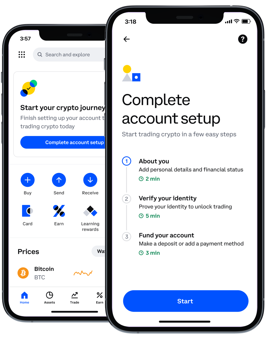
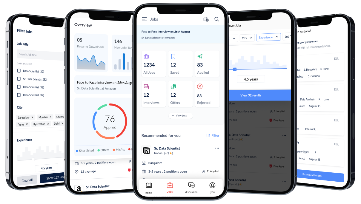
As an extension to the above-listed principles, we continued with the approach of warm and friendly, for which we used the least amount of layers for the design, allowing a more planar experience, with overall layers reduced to just 4 i.e. background, app layer, header/footer and pop-up or bottom sheet.
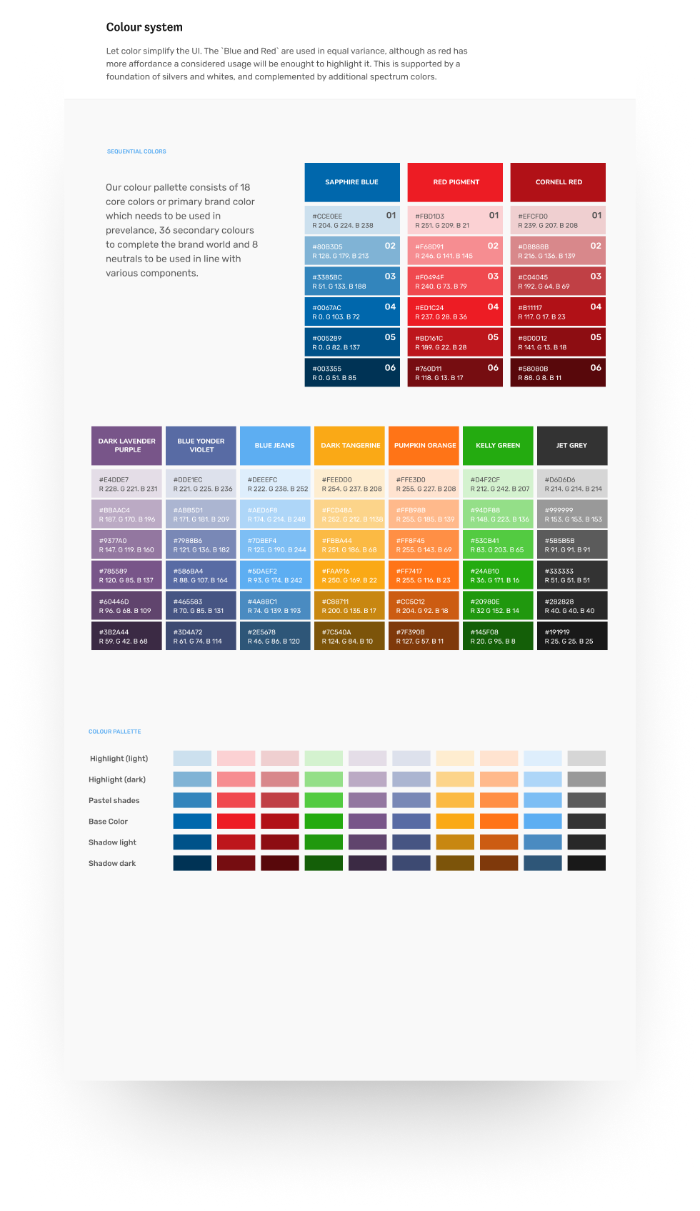
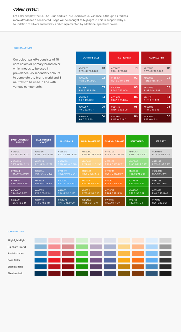
We created a larger palette of secondary and tertiary colours to be used intermittently.
Our goal was to shed off weight from the overall look and feel and hence light and shadows helped us do so.
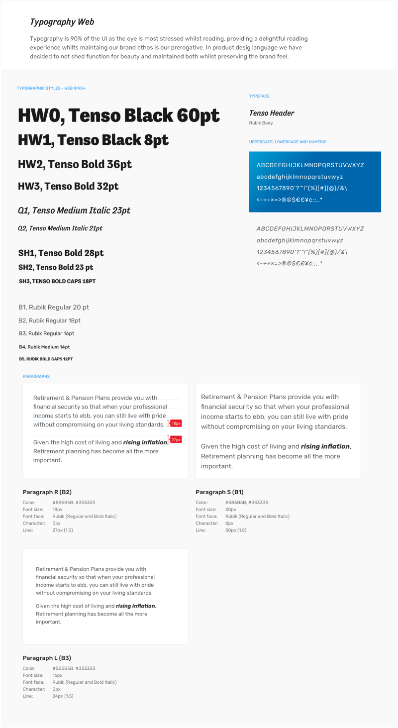
Our typography was especially identified to provide clarity with a character further enhancing trust whereas shedding off the weight from the overall brand.
We even changed the tone of language to make it more first person rather than third person, we will with time refine it for our users to see us as a friend they can come to.
Whilst we continued with the volume guidance set by Google for the iconography we created a stroke and colour feel which allowed us to communicate the humanistic values we seek to engender.